top of page


From a human-led street activation to a lasting brand system.
Leukemia survivors launched the campaign by hand-delivering leaflets in public spaces, creating direct human connection and nationwide attention.
At the center of the campaign was a proprietary symbol. The orange Bow Tie replaced generic charity iconography and became the Foundation’s primary physical identifier, still in use more than fifteen years later.
From a human-led street activation to a lasting brand system.


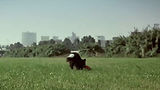
Print and film amplified the idea by contrasting hospitals where children shouldn’t be with playgrounds where they were missing.


bottom of page